
What is a Control Chart?
A Control Chart is a statistical tool used in quality control to monitor how a process changes over time. It helps determine whether a process is stable, predictable, and operating within set control limits.
A control chart has:
- Central Line (CL) – average value
- Upper Control Limit (UCL) – maximum expected variation
- Lower Control Limit (LCL) – minimum expected variation
If the process stays within UCL and LCL, the process is in control. If points go outside limits or show patterns, it indicates special cause variation that must be corrected

Guidelines for Control Chart:
A control chart always has a central line for the average, an upper line for the upper control limit and a lower line for the lower control limit. These lines are determined from historical data.
By comparing current data to these lines, you can conclude whether the process variation is in control or out of control.
When to Use a Control Chart :
- When controlling ongoing processes by finding and correcting problems as they occur.
- When predicting the expected range of outcomes from a process.
- When determining whether a process is stable.
- When analysing patterns of process variation from special causes or common causes (within the process).
- When determining whether your quality improvement project should aim to prevent specific problems or to make fundamental changes to the process.
Control Chart Basic Procedure:-
- Choose the appropriate control chart for your data.
- Determine the appropriate period for collecting and plotting data.
- Collect data, construct your chart and analyse the data.
- Look for “out-of-control signals” on the control chart. When one is identified, mark it on the chart and investigate the cause. Document how you investigated, what you learned, the cause and how it was corrected.
- Continue to plot data as they are generated. As each new data point is plotted, check for new out-of-control signals.
How to interpret the control chart?
- Any point out of the control limit ( Out of Zone A)
- Seven points in a row on one side of the centre line.
- Six points in a row, continuously increasing or decreasing order.
- Fourteen points in a row alternating up and down.
- Two out of three points in a row in the same zone A.
- Four out of five points are in the arrow in the same zone B.
- Fifteen points in a row in zone C above or below the centre line.
- Eight points in the arrow on both sides of the centre line, but none in zone C.
Guidelines for eliminating Special cause variation:
- Get timely data so that you see the effect of the assignable cause soon after it occurs.
- As soon as you see something indicating that an assignable cause of variation has happened, search for the cause.
- Change tools to compensate for the assignable cause.
Guidelines for reducing Common cause variation:
- Reducing common-cause variation usually requires making fundamental changes in your process.
- Addressing the common cause variation will improve the process performance.
You may also read about SPC, Control Charts and Histogram.
Who Invented the Control Chart?
The control chart was invented by Dr Walter A. Shewhart in 1924 at Bell Laboratories.
Because of this, control charts are also called Shewhart charts.
Why Control Charts are used
Control charts help:
- Monitor process quality
- Detect unusual variations
- Reduce defects, rework, and scrap
- Maintain consistency in production
- Support continuous improvement
They are widely used in manufacturing, automotive, electronics, service processes, and supplier quality control.
Types of Control Charts
Control charts are mainly of two types based on data:
A. Variable Data Control Charts
Used when measurements are continuous (e.g., diameter, weight, length).
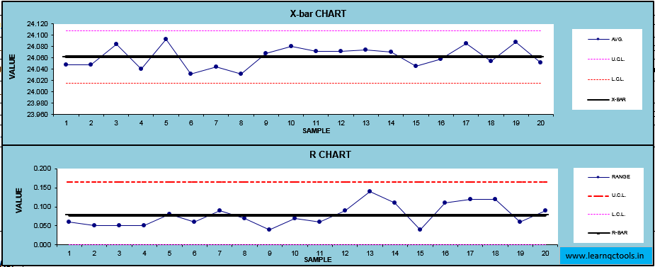
1. X-Bar Chart
Used to monitor changes in the average of the process.
2. R Chart (Range Chart)
Used to monitor variation in a process over time.
3. S Chart (Standard Deviation Chart)
Used for larger sample sizes to track standard deviation.
B. Attribute Data Control Charts
Used when data is counted (e.g., OK/Not OK, defects per unit).
1. p Chart
Used for proportion defective when the sample size varies.
2. np Chart
Used for the number of defective units when the sample size is constant.
3. c Chart
Used for counting the number of defects per unit.
4. u Chart
Used for defects per unit when the inspection area or quantity differs.
When to use which Control Chart
| Data Type | Chart Type | When to Use |
|---|---|---|
| Variable | X-bar Chart | To monitor the average of measurements |
| Variable | R Chart | To check variation in a small subgroup |
| Variable | S Chart | For subgroup size >10 |
| Attribute | p Chart | Defective proportion with varying sample sizes |
| Attribute | np Chart | Defective count with fixed sample sizes |
| Attribute | c Chart | Count of defects per unit |
| Attribute | u Chart | Defects per unit with variable sample sizes |
Control Chart Example
Consider a shaft manufacturing process (Automotive vendor to MSIL).
Daily measurements are taken:
- Target diameter: 20.00 mm
- Daily samples: 5 shafts
If the average diameter increases or decreases consistently, or data points cross UCL/LCL, it indicates that the process needs investigation (tool wear, improper setting, operator error, etc.).
Benefits of Control Charts
Control charts help organisations:
- Detect special cause variations quickly
- Reduce scrap, rework, and warranty issues
- Improve process stability
- Maintain consistent product quality
- Improve customer satisfaction
- Predict future performance
- Help meet ISO 9001 & IATF 16949 requirements
- Support continuous improvement programs
- Increase productivity and efficiency
- Predict processes out of control and out of specification limits.
- Distinguish between specific, identifiable causes of variation.
- Control charts allow operators to detect manufacturing problems before they occur, which greatly reduces the need for product rework and reduces COPQ.
- Control charts provide an early warning detection system to make changes in the running process.
- It can be used for statistical process control.
- After analysing a control chart, operators need to determine whether to “do something” (adjust in the process) or “do nothing” (let the process run as is).
Rules of Control Charts (Western Electric Rules)
A process is out of control if any of the following occur:
- One point beyond UCL or LCL
- Seven consecutive points on one side of the central line
- Six points trending upward or downward
- Fourteen points alternating up and down
- Two out of three points near the UCL or LCL
- Eight points in a row, more than 1 SD away from CL
- Sudden jump or drop without reason
These rules help identify abnormal patterns or special causes.
How to Construct a Control Chart (Step-by-Step)
- Collect data
- Calculate the mean and range
- Calculate control limits (UCL & LCL)
- Plot points in time order
- Add lines for CL, UCL, and LCL
- Interpret patterns
- Investigate special causes
- Take corrective actions
Difference Between Control Chart and Run Chart
| Feature | Control Chart | Run Chart |
|---|---|---|
| Limits | Has UCL & LCL | No control limits |
| Purpose | Identify stability & special causes | Detect trends & shifts |
| Statistical Power | High | Low |
| Use in Audit | Mandatory for SPC | Optional |
Frequently Asked Questions (FAQ)
1. What is a control chart in simple words?
A control chart is a graph used to check whether a process is stable and predictable.
2. Why are control charts used?
They detect unusual variations and help maintain consistent quality.
3. Who invented control charts?
Dr Walter A. Shewhart in 1924.
4. What are the rules of control charts?
Western Electric Rules, such as one point beyond limits, 7 points on one side, trends, cycles, etc.
5. What are the types of control charts?
X-bar, R, S, p, np, c, u charts.
6. What are UCL and LCL?
Upper and lower control limits that define the expected range of variation.
7. What is the difference between specification limits and control limits?
- Control limits are based on process performance
- Specification limits are set by customers or design
Conclusion
Control charts are powerful SPC tools used to monitor, control, and improve process quality. They help identify special causes, ensure stable production, reduce defects, and meet ISO/IATF requirements. Adding control charts in daily quality monitoring improves consistency and customer satisfaction.