
A Pareto Chart is one of the 7 Basic Quality Tools used to identify the most significant factors in a problem. It is based on the Pareto Principle (80/20 Rule), which states that roughly 80% of effects come from 20% of causes. This chart helps organizations focus on the “vital few” issues that create the majority of defects, delays, or losses instead of wasting resources on the “trivial many.”
Widely used in quality management, manufacturing, service industries, and project management, the Pareto diagram combines a bar graph with a cumulative percentage line to show which problems should be addressed first for maximum improvement.
What is the Pareto Principle (80/20 Rule)?
The Pareto Principle was introduced by Italian economist Vilfredo Pareto, who observed that 80% of Italy’s wealth was owned by 20% of the population. Later, quality expert Joseph Juran applied this concept to quality management.
In business and manufacturing, the 80/20 rule commonly appears as:
• 80% of defects arise from 20% of causes
• 80% of complaints come from 20% of products or services
• 80% of downtime is caused by 20% of equipment issues
• 80% of rework originates from a few key processes
The Pareto Chart visually highlights these critical causes so teams can prioritize improvement actions effectively.
Key Components of a Pareto Chart

A standard Pareto Chart contains the following elements:
• Categories — Different causes or problem types
• Bars — Represent frequency, cost, or impact of each category
• Descending Order — Bars arranged from highest to lowest value
• Cumulative Percentage Line — Shows the running total impact
• Left Vertical Axis — Frequency or number of occurrences
• Right Vertical Axis — Cumulative percentage (0–100%)
The point where the cumulative line reaches around 80% typically separates the “vital few” from the “trivial many.”
Why Pareto Chart is important in Quality Management
Pareto analysis helps organizations make data-driven decisions. Instead of guessing where problems originate, teams can focus on areas that will deliver the biggest improvement.
In ISO 9001 and IATF 16949 environments, Pareto Charts are commonly used for:
• Customer complaint analysis
• Internal defect prioritization
• CAPA planning (Corrective and Preventive Actions)
• Supplier performance evaluation
• Production downtime reduction
• Cost of poor quality (COPQ) analysis
• Audit findings prioritization
For manufacturing organizations, this tool is essential for continuous improvement and root cause analysis.
Step-by-Step Procedure to Create a Pareto Chart
Step 1: Identify the Problem
Clearly define what you want to analyze — defects, complaints, failures, delays, or losses.
Step 2: Collect Data
Use a check sheet or data collection method over a defined period.
Step 3: List Categories
Group data into meaningful causes or defect types.
Step 4: Count Frequency
Determine how often each category occurs.
Step 5: Sort in Descending Order
Arrange categories from highest to lowest frequency.
Step 6: Calculate Cumulative Percentage
Compute running totals and convert to percentages.
Step 7: Draw the Chart
Plot bars for frequency and a line for cumulative percentage.
How to Create a Pareto Chart in Excel
Excel makes Pareto chart creation quick and accurate.
Method
- Enter categories and frequencies in two columns
- Select the data range
- Go to Insert → Statistical Chart
- Choose Pareto Chart
- Customize titles, labels, and formatting
Manual Method (All Excel Versions)
- Sort data in descending order
- Calculate cumulative percentage
- Insert column chart for frequency
- Add line chart for cumulative percentage
- Set secondary axis to 0–100%
Pareto Chart Example (Manufacturing)
Consider a company analyzing product defects:
• Scratch — 120
• Dent — 95
• Paint Issue — 60
• Dimension Error — 25
• Packaging Damage — 15
A Pareto Chart will show that scratches and dents alone contribute to the majority of defects. By focusing improvement efforts on surface protection and handling processes, the company can significantly reduce total defects.
Advantages of Pareto Chart
• Identifies the most important problems quickly
• Helps prioritize improvement efforts
• Supports data-driven decision making
• Improves resource utilization
• Easy to understand and communicate
• Useful across manufacturing and service sectors
• Supports continuous improvement initiatives
Limitations of Pareto Chart
• Does not identify root causes by itself
• Requires accurate and sufficient data
• Assumes categories are independent
• May oversimplify complex problems
• Not suitable for time-based trend analysis
Therefore, Pareto analysis is often used along with tools such as Fishbone Diagram, 5 Why Analysis, and Control Charts.
Pareto Chart vs Histogram
A histogram shows the distribution of data across intervals, while a Pareto Chart focuses on categorical causes arranged by importance.
Histogram — Shows pattern of variation
Pareto Chart — Shows priority of causes
Both tools are part of the 7 QC Tools but serve different purposes.
Frequently Asked Questions (FAQs)
What is a Pareto Chart used for?
It is used to identify the most significant causes of a problem so improvement efforts can be prioritized.
What is the 80/20 rule in Pareto analysis?
It states that a small number of causes typically generate the majority of effects.
Who invented the Pareto Principle?
Italian economist Vilfredo Pareto developed the concept, later applied to quality management by Joseph Juran.
How do you create a Pareto Chart in Excel?
Use the built-in Pareto chart option in Excel or manually create a column chart with a cumulative percentage line.
Is Pareto Chart one of the 7 QC Tools?
Yes, it is one of the 7 fundamental quality control tools used worldwide.
How do make Pareto Chart in excel?
- Develop a list of problems, items or causes to be compared.
- Collect the data as per the defined time frequency
- Tally for each item, and how often it occurred. Determine the grand total for all items.
- Find the percentage of each item.
- List the items being compared in decreasing order of measure of comparison: e.g., the most frequent to the least frequent. The cumulative % for an item is the sum of that item’s percent of the total and that of all the other items that come before it in the ordering by rank.
- List the items on the horizontal axis of a graph from highest to lowest. Label the left vertical axis with the numbers, then label the right vertical axis with the cumulative% (the cumulative total should equal 100%). Draw in the bars for each item.
- Draw a line graph of the cumulative %. The first point on the line graph should line up with the top of the first bar.
- Analyze the diagram by identifying the most critical items.
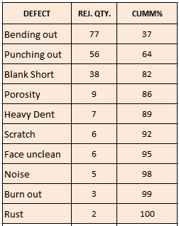
| S.No | Defect | Rej. Qty | Cumm Qty | Cumm % (Cumm Qty/Total Rej Qty*100) |
| 1 | Bending out | 77 | 77 | 37 |
| 2 | Punching out | 56 | 133 | 64 |
| 3 | Blank Short | 38 | 171 | 82 |
| 4 | Porosity | 9 | 180 | 86 |
| 5 | Dent | 7 | 187 | 89 |
| 6 | Scratch | 6 | 193 | 92 |
| 7 | Face unclean | 6 | 199 | 95 |
| 8 | Noise | 5 | 204 | 98 |
| 9 | Burn out | 3 | 207 | 99 |
| 10 | Rust | 2 | 209 | 100 |
| Total | 209 |
Note: Hide the Cumm Qty column in Excel while selecting the Pareto chart as below.

Conclusion
A Pareto Chart is a powerful and practical tool for identifying the most critical issues affecting performance. By applying the 80/20 rule, organizations can focus on the few causes that generate the majority of problems, leading to faster improvements, reduced costs, and better quality outcomes.
Whether used in manufacturing, service industries, or project management, Pareto analysis remains one of the most effective techniques for prioritization and continuous improvement.
If you want to implement quality tools like Pareto Analysis, Fishbone Diagram, and other 7 QC Tools in your organization, professional guidance can significantly accelerate results and ensure alignment with ISO 9001 and IATF 16949 requirements.
🎯Need help implementing QMS and quality tools in your company? QC Tools Solutions provides expert consultancy, training, and implementation support for manufacturing organizations.