A scatter diagram is one of the 7 QC tools used in quality control to analyze the relationship between two variables. It helps identify patterns, trends, and possible causes of defects in manufacturing processes.
This guide explains scatter diagram examples, correlation, types, and practical applications in quality control.
- What is a Scatter Diagram?
- Scatter Diagram Example (Manufacturing Case)
- Scatter Diagram Correlation Explained
- Types of Scatter Diagram
- How to Draw a Scatter Diagram (Step-by-Step)
- Use of Scatter Diagram in Quality Control
- Advantages of Scatter Diagram
- Limitations of Scatter Diagram
- Practical Shop Floor Example
- How to solve problems with a scatter diagram?
- How to analyze a scatter diagram?
- Typical Pattern of correlation :
- What is the use of a scatter diagram in quality control?
- How to construct the scatter diagram?
- FAQs on Scatter Diagram
- Conclusion
What is a Scatter Diagram?
A scatter diagram (also called a scatter plot) is a graphical tool used to display the relationship between two variables.
• One variable is plotted on the X-axis
• Another variable is plotted on the Y-axis
• Each point represents one observation
👉 It helps answer:
“Is there a relationship between these two factors?”
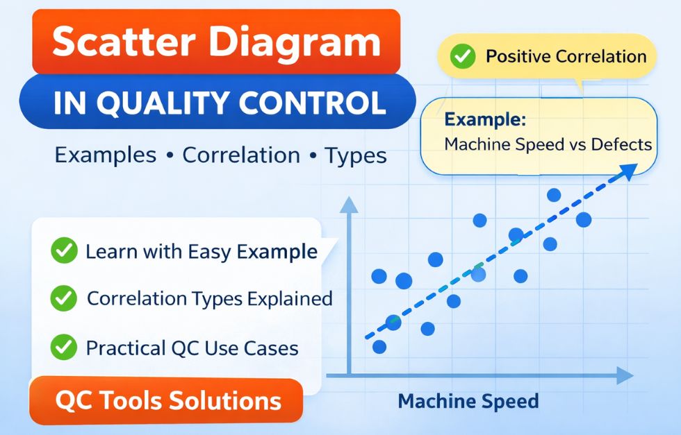
Scatter Diagram Example (Manufacturing Case)
Understanding becomes easy with a practical example.
Example:
• X-axis → Machine Speed
• Y-axis → Number of Defects
Observation:
• As machine speed increases, defects also increase
👉 Conclusion:
There is a positive correlation between speed and defects.
Scatter Diagram Correlation Explained
The main purpose of a scatter diagram is to identify correlation (relationship) between variables.
Types of Correlation:
1. Positive Correlation
• Both variables move in same direction
• Example: Speed ↑ → Defects ↑
2. Negative Correlation
• One increases, other decreases
• Example: Training ↑ → Defects ↓
3. No Correlation
• No visible relationship
• Random distribution
4. Strong vs Weak Correlation
• Strong → Points close together
• Weak → Points scattered
👉 Important:
Correlation does NOT mean cause and effect
Types of Scatter Diagram
Based on pattern of points:
• Strong Positive Correlation
• Weak Positive Correlation
• Strong Negative Correlation
• Weak Negative Correlation
• No Correlation
• Curvilinear Relationship (non-linear pattern)
How to Draw a Scatter Diagram (Step-by-Step)
Follow these simple steps:
Step 1: Collect Data
Identify two variables (e.g., temperature & defects)
Step 2: Draw Axes
• X-axis → Independent variable
• Y-axis → Dependent variable
Step 3: Plot Points
Plot each data pair on graph
Step 4: Analyze Pattern
Look for trend or relationship
Use of Scatter Diagram in Quality Control
Scatter diagrams are widely used in manufacturing:
• Identify root causes of defects
• Analyze process variation
• Improve product quality
• Support data-based decisions
• Validate improvement actions
👉 Common applications:
• Machine setting vs rejection
• Temperature vs defects
• Operator skill vs productivity
To identify root causes after correlation analysis, use Cause and Effect Diagram.
Advantages of Scatter Diagram
• Simple and easy to use
• Visual representation of data
• Helps identify relationships
• Supports problem solving
Limitations of Scatter Diagram
• Does not prove cause-effect
• Needs sufficient data
• Interpretation can be subjective
Practical Shop Floor Example
In a sheet metal process:
• X-axis → Punch wear
• Y-axis → Burr height
Result:
As punch wear increases, burr height increases
👉 Action Taken:
• Tool replacement schedule defined
• Defects reduced
How to solve problems with a scatter diagram?
Following are the main steps about the relationship between variables and the use of a scatter diagram in problem-solving.
Step 1: Finding an actual cause-and-effect relationship is the key to effective problem-solving.
Step 2: Cause and effect relationships usually show variation.
Step 3: It is easier to check the relationship in a scatter diagram than in a simple number table.
A scatter diagram only shows the relationship between two variables. It does not prove that one variable causes the other. So one must have a logical practical explanation to establish a cause-and-effect relationship.
How to analyze a scatter diagram?
① Develop a reasonable and relevant theory about the suspected relationship between two variables of interest.
② Collect proper both types of data and construct a scatter diagram.
③ Identify and classify the pattern of correlation.
④ Question your original theory and consider other aspects of the observed pattern of correlation.
Typical Pattern of correlation :
What are the Types of scatter diagrams?
Strong, Positive Correlation: The value of Y clearly increases as the value of X increases.
Strong, Negative Correlation: The value of Y clearly decreases as the value of X increases.
Weak, Positive Correlation: The value of Y increases somewhat as the value of X increases.
Weak, Negative Correlation: The value of Y decreases somewhat as the value of X increases.
Complex Correlation: The value of Y appears to be related to the value of X, but the relationship is not smooth.
No Correlation: For any value of X, Y can have both large and small values. It does not appear to be any particular relationship between X and Y.

What is the use of a scatter diagram in quality control?
1. Testing theories and identifying root causes :
Scatter diagrams are primarily used to examine theories about cause-effect relationships as a team searches for the root cause of the problem under investigation. Construction of a scatter diagram is a natural next step after a team develops a cause-and-effect diagram.
2. Designing solutions and holding the gains:
A Scatter diagram can also be useful in helping a team design a control system to hold the gains from a quality improvement effort.
How to construct the scatter diagram?
Following are the steps for making a scatter diagram,
Step 1: Obtain the table of raw data and determine the high and low values of each variable.
Step 2: Decide which variable will be plotted on the horizontal axis.
Step 3: Draw and label the horizontal and vertical axes.
• Make the axes roughly the same length, creating a square plotting area.
• Label the axes in about six convenient multiples of one, two or five. Make the lowest label slightly greater than the high value for the variable.
• Label increasing value from bottom to top on the vertical axis and left to right on the horizontal axis.
• Provide a caption to describe the measurement and its units.
Step 4: Plot the paired data.
• Use concentric circles to indicate identical paired data points.
• Use filled and unfilled symbols to show the strata.
Step 5: Title the chart and provide other appropriate notations.
Step 6: Identify and classify the pattern of correlation.
Step 7: Check for potential pitfalls in your analysis.
FAQs on Scatter Diagram
What is scatter diagram in quality control?
It is a tool used to analyze the relationship between two variables to identify patterns and causes of defects.
What are types of scatter diagram?
Positive, negative, no correlation, strong, weak, and curvilinear patterns.
What is correlation in scatter diagram?
Correlation shows how two variables are related to each other.
Give an example of scatter diagram
Machine speed vs defects is a common example in manufacturing.
Conclusion
Scatter diagram is a powerful yet simple tool for identifying relationships between variables in quality control. When used correctly, it helps in root cause analysis, process improvement, and decision making.
For best results, always combine it with other QC tools and validate findings before taking action.
👉 Related QC Tools You Should Learn
To strengthen your quality analysis skills, you should also learn these important QC tools:
• Seven Basic Quality Tools – Foundation of all quality improvement techniques
• Check Sheet – For structured data collection before analysis
• Histogram – To understand variation and frequency
• Pareto Chart – To identify major causes of defects
• Cause and Effect Diagram – For finding potential cause
• Control Chart – To monitor process stability
• Poka-Yoke – To prevent defects at source
I love your blog.. very nice colors & theme.
Did you make this website yourself or did you hire someone to
do it for you? Plz respond as I’m looking to design my own blog and would like to know
where u got this from. cheers
I myself design my website.