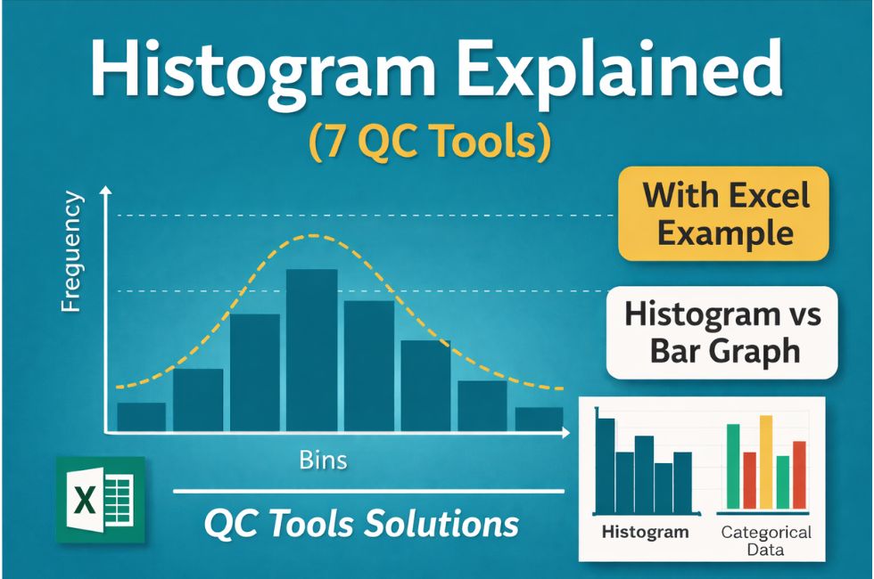
What is a Histogram Chart?
A Histogram is one of the 7 Basic Quality Control (QC) Tools used to represent the distribution of numerical data. It shows how frequently data values occur within specific ranges called bins.
In simple words, a histogram converts raw data into a visual form so that you can easily understand:
• Variation in process
• Data spread
• Pattern of distribution
Unlike a bar graph, a histogram is used for continuous data, such as length, weight, temperature, or diameter.
- What is a Histogram Chart?
- Histogram in 7 QC Tools
- Histogram Diagram with Example
- Histogram Chart Benefits
- Histogram vs Bar Graph
- Histogram vs Control Chart
- How to Make Histogram in Excel
- Real Industrial Example
- Common mistakes while using Histogram
- Key concepts about histograms:
- How to use and interpret a histogram?
- How many types of histograms?
- Precautions in the Interpretation of Histogram
- Use of Histogram in Quality Control:
- How to make a histogram?
- Frequently Asked Questions (FAQ)
- Conclusion
Histogram in 7 QC Tools
Histogram plays a very important role in quality control and process improvement. It helps engineers and quality professionals to understand how a process is performing.
Key purposes:
• Analyze process variation
• Identify distribution pattern (normal, skewed, bimodal)
• Detect abnormalities in process
• Support decision-making in quality improvement
In industries like automotive and manufacturing, histograms are widely used to analyze:
• Shaft diameter variation
• Part Critical dimensions
Data for histogram is usually collected using Check Sheet in 7 QC Tools.
A French statistician A M Guerry first developed a histogram in 1833. Guerry introduced a new kind of bar graph to describe his analysis of crime data.
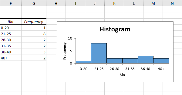
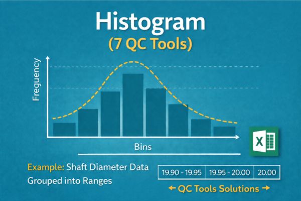
Histogram Diagram with Example
Example: Suppose you measure the diameter of 50 shafts.
Instead of checking each value individually, you group them into ranges like:
• 19.90–19.95
• 19.95–20.00
• 20.00–20.05
Then you count how many values fall into each range. This creates a histogram that clearly shows whether your process is centered or not.
Histogram Chart Benefits
Histogram is one of the simplest yet most powerful tools. Its major benefits include:
• Easy visualization of data distribution
• Helps identify variation and spread
• Detects outliers and abnormal patterns
• Supports process improvement decisions
• Useful for large data sets
• Quick understanding without complex calculations
To identify major causes of defects, you can also use Pareto Chart in 7 QC Tools
Histogram vs Bar Graph
Many people confuse histogram with bar graph, but both are different.
| Feature | Histogram | Bar Graph |
|---|---|---|
| Data Type | Continuous | Categorical |
| Bars | No gaps | Gaps present |
| Purpose | Distribution analysis | Comparison of categories |
| Example | Height, weight | Product types |
Key difference: Histogram shows data distribution, while bar graph compares categories.
Histogram vs Control Chart
Histogram and Control chart are both QC tools but used for different purposes.
| Feature | Histogram | Control Chart |
|---|---|---|
| Shows | Data distribution | Process variation over time |
| Time-based | No | Yes |
| Purpose | Understand spread | Monitor stability |
| Output | Frequency bars | Trend line with limits |
Important concept:
Histogram shows how data is distributed, while control chart shows whether the process is stable over time.
How to Make Histogram in Excel
Creating a histogram in Excel is simple:
Step 1: Enter your data in one column
Step 2: Select the data
Step 3: Go to Insert tab
Step 4: Click on Insert Statistic Chart
Step 5: Choose Histogram
Step 6: Adjust bin width as required
Excel automatically generates the histogram, making it easy for analysis.
Real Industrial Example
In manufacturing industries, histogram is widely used for process analysis.
Example: Shaft Diameter Inspection
A company measures 100 shafts. The histogram shows that most values are slightly above the target.
Conclusion:
• Process is shifted
• Adjustment required
This helps prevent defects before mass production.
Common mistakes while using Histogram
Avoid these mistakes:
• Choosing incorrect bin size
• Using histogram for categorical data
• Misinterpreting skewed distribution
• Ignoring outliers
• Not collecting sufficient data
Correct usage ensures accurate analysis and better decision-making.
Key concepts about histograms:
① Values in a set of data usually show variation: Variation is everywhere. It is inevitable in the output of any process. It is impossible to keep all factors in a constant state all the time.
② Variation always shows a pattern: Different factors will have different variations, but there is always some pattern to the variation. These patterns of variation in data are called distributions.
There are three important characteristics of a histogram :
ⓐ It’s center
ⓑ Its width
ⓒ Its shape
③ Pattern of variation is difficult to see in a simple table of numbers
④ Pattern of variation is easier to see when data are summarized pictorially in a histogram.
How to use and interpret a histogram?
Identifying and explaining the pattern of variation: The goal of the analysis of a histogram is to :
- Identify and classify the pattern of variation
- Develop a reasonable and relevant explanation for the pattern.
- To study relationship between variables, use Scatter Diagram in QC Tools
How many types of histograms?
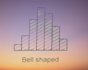
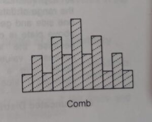
① Bell-shaped Distribution :
A symmetrical shape with a peak in the middle of the range of the data. This is the normal distribution of data from a process. Deviation from this bell shape may indicate the presence of outside influence.
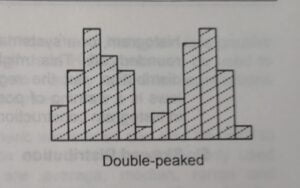
② Double Peaked Distribution :
A significant drop in the middle of the range of data with a peak on either side. This pattern normally combines two bell-shaped distributions and suggests that two distinct processes are at work.
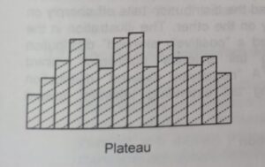
③ Plateau Distribution :
A flat top with no distinct peak and a slight tail on either side. This pattern is likely to be the result of many different bell-shaped distributions with centers spread evenly throughout the range of the data.
④Comb Distribution :
High and low values alternate regularly. This pattern typically indicates measurement error, errors in the way the data were grouped to construct the histogram. The presence of alternating high and low is a warning of possible errors in data collection.
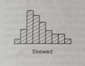
⑤ Skewed Distribution :
An unsymmetrical shape in which the peak is off-center in the range of data and the distribution tails off sharply on one side and gently on another side. This may be positively skewed or negatively skewed as per rightward or leftward respectively.
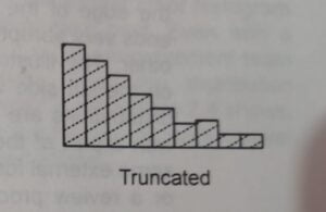
⑥ Truncated Distribution :
An unsymmetrical shape in which the peak is at or near the edge of the range of data and the distribution ends on one side and tail off gently on the other.
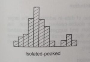
⑦ Isolated peaked Distribution :
A small, separate group of data in addition to the larger distribution. It is like the double-peaked distribution. However, the small size of the second peak indicates an abnormality.
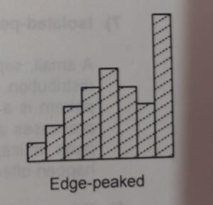
⑧Edge peaked Distribution:
A large peak is attached to an otherwise smooth distribution. This shape occurs when the extended tail of the smooth distribution has been cut off and lumped into a single category at the edge of the range of the data.
Precautions in the Interpretation of Histogram
There are 3 main precautions during interpreting histograms.
- Data should be from the current and typical conditions of the process.
- The sample size should be large.
- Interpretation of the histogram must be confirmed through analysis & observation of the process.
Use of Histogram in Quality Control:
- The histogram is a simple but powerful analytical tool that helps us to understand the process and develop reasonable, fact-based theories about the root cause of the problems.
- To check the process performance
How to make a histogram?
Below are the steps in constructing a Histogram:
Step 1: On the raw data table, determine the high value, low value and range.
Step 2: Decide on the number of cells
| Number of Data Points | Recommended Number of Cells |
|---|---|
| 20 – 50 | 6 |
| 51 – 100 | 7 |
| 101 – 200 | 8 |
| 201 – 500 | 9 |
| 501 – 1000 | 10 |
| Over 1000 | 11 – 20 |
Step 3: Calculate the approximate cell width
Step 4: Round the cell width to a convenient number
Step 5: Construct the cells by listing the cell boundaries
Step 6: Tally the number of data points in each cell
Step 7: Draw and label the horizontal axis
Step 8: Draw and label the vertical axis
Step 9: Draw in the bars to represent the number of data points in each cell.
Step 10: Title the chart, indicate the total number of data points and show nominal values and limits.
Step 11: Identify and classify the pattern of variation
Step 12: Develop a reasonable and relevant explanation for the pattern
Frequently Asked Questions (FAQ)
What is histogram in 7 QC tools?
Histogram is a graphical representation of data distribution used to analyze variation in a process.
What is difference between histogram and bar graph?
Histogram is used for continuous data, while bar graph is used for categorical data.
How to create histogram in Excel?
Use Insert → Statistic Chart → Histogram after selecting your data.
What are histogram benefits?
It helps visualize data distribution, identify variation, and improve process quality.
Conclusion
Histogram is a powerful and easy-to-use tool in the 7 QC tools toolkit. It helps quality professionals understand data behavior, identify variation, and improve processes effectively. When combined with tools like control charts and Pareto analysis, it becomes even more valuable for decision-making and continuous improvement. Data for histogram is usually collected using Check Sheet in 7 QC Tools, and further analyzed using tools like Pareto Chart in 7 QC Tools and Control Chart in SPC for better decision-making.
Thankyou for sharing the information with us.